I’ve recently had a short discussion with the Roadie team about how to design some small UI component. It was an input control that was meant to allow user to switch between viewing all and only non-empty Jira task groups. This component was to be placed in the overview page, where only the most essential information had to be displayed and the space was highly valuable.
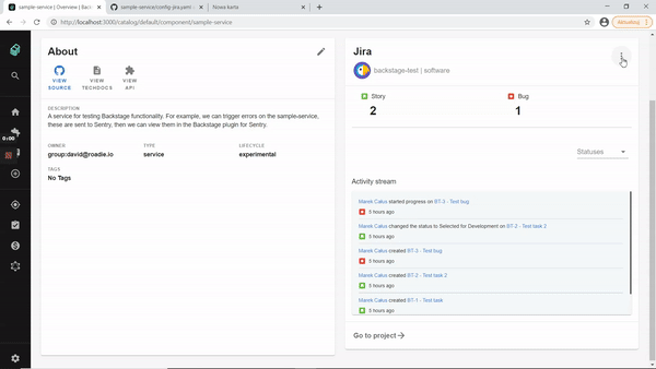
When working with component system like MaterialUI I have to work with limited set of UI primitives (that’s not necessary a drawback - users are already familiar with those so they will have easier time learning how to use my site). Only two options that came to my mind were: expanding panel with some title like “empty groups” that would contain all the “optional” things to display and the permanent (localStorage) toggle in the “more options” menu in the upper right corner of the card.
Knowing our requirements:
- not cluttering the UI with information that is not relevant 99% of times - because it’s an overview card,
- being able to switch between two views
we have to choose based on their drawbacks:
- permanent (localStorage) toggle - It feels like an “overkill” to have a local storage save and a menu for a just one option.
- expanding panel - cluttering of the ui
I don’t want to come up with any other solution (like toggle-expand-in-the-menu chimera) and from the two above, I choose permanent (localStorage) toggle - it’s working is familiar for users and fulfills all requirements.
It’s tempting to solve UI problems with components that just straightforward address the case, but it’s better for users to have the one that is closest from the set of things they already are familiar with.
Sincerely yours,
~Marek